DC Water Emergency Reporting App
This capstone project is about designing an emergency reporting app working with DC Water. I mainly focused on visual design and interaction design of prototype on this project. Also, I led end-user test sessions to find meaningful insights at the end of each iteration.
Role & Responsibilities: Visual Design, Interaction Design, User Testing, Project Communicator, UX Research
Timeline: September 2021 - December 2021
The Goal
DC Water distributes drinking water and collects and treats wastewater for District of Columbia. As part of its operations it maintains a robust customer service and problem reporting system. During large scale emergencies, such as boil water alert, the hotline receives a high volume of phone calls. This causes distractions for the command center as staff have to response to the phone calls. They would like to reduce distractions and improve efficiency by developing and deploying an emergency reporting app.
Approach
We conducted user research, ideation, design, prototyping and evaluation with using five-week "Design Sprint". During the project, we will conduct five iterations/cycles of this five-week Design Sprint. (I participated in two iterations in Fall 2021)
Sprint 1 (Sep 20 - Oct 22)
The first sprint sets the project focus for the year. It will refine our understanding of the problem and opportunity; develop our shared knowledge; set the initial approach and design concept; and validate this through preliminary evaluation with both command center staff and clients. It entails a higher level of client engagement than other sprints, to ensure all team members and project stakeholders are aligned.
Map
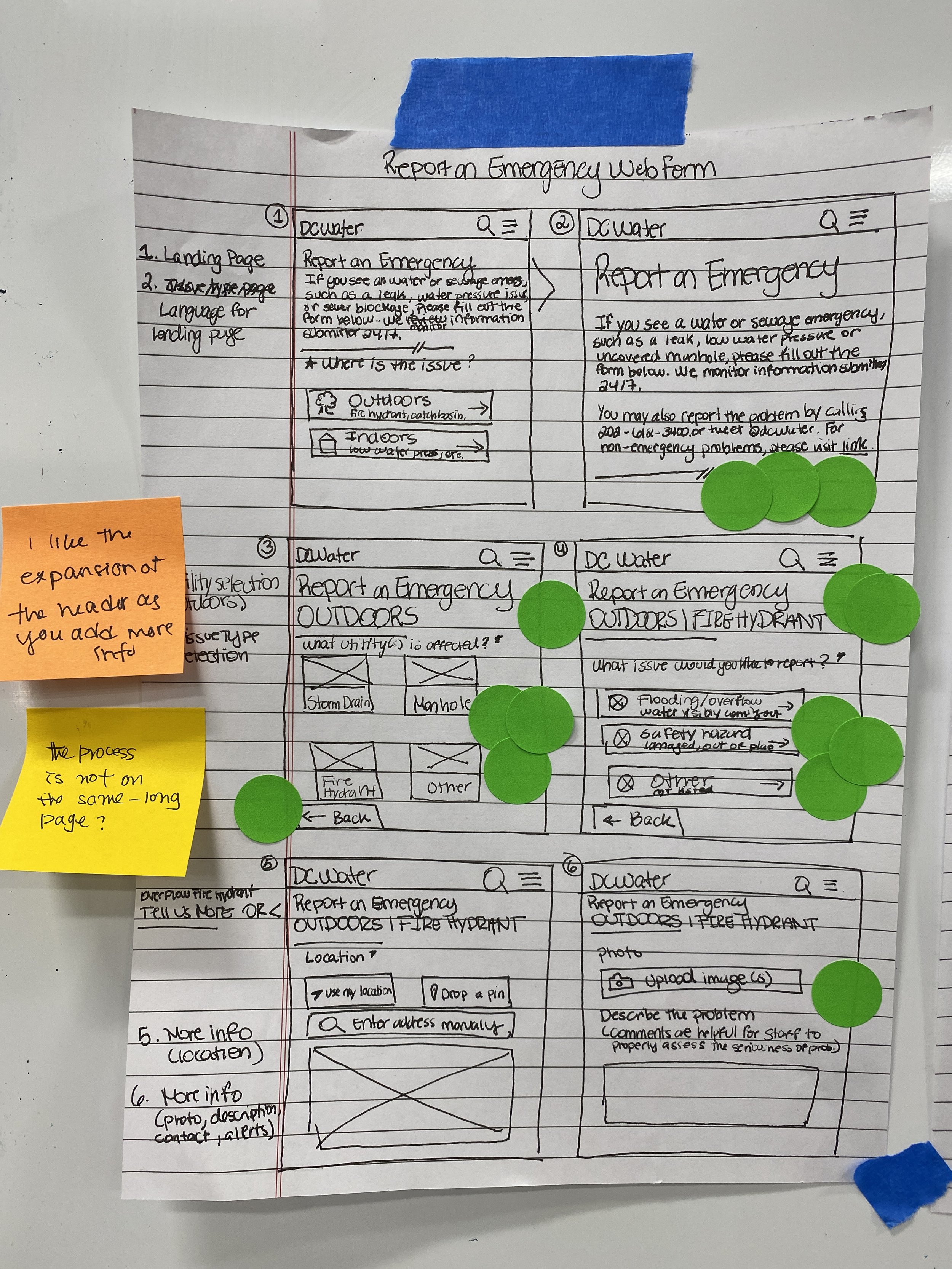
The focus of the first Sprint is designing quick and easy reporting system that can be appealing to the users especially non-existing users (who do not usually interact with DC Water). Based on the kick-off meeting and interviews with experts, we created the overall user flow and identified the focus for the first Sprint.
Sketch
We gathered key design ideas from sketches to improve for the prototype. Standout ideas were, for example, opt-in notification, confirmation page, upload images, and some button/icon shapes.
Prototype
Design Considerations
Quicker Process - Users can complete the reporting process with less than 5 key strokes.
Easier to access - Designing for responsive web pages with new URL rather than designing for native mobile app
Testing
Demographics
5 users (tested prototype with 4 users)
Key Findings
Users were unsure what the difference between emergency and non-emergency issues were and the problem and issue types
Users were confused about the jargon/language (i.e. “catch basin”) used on the interface
Users may not use the direct URL and tend to google it
Users said they were very likely to upload image and share location of problem
Users appreciated having multiple options to share location
Users had a positive reaction to prototype and thought the reporting process was quick, easy and straightforward
Potential Design Changes
Give a quick but detailed guide about what is considered as emergency.
Consider using simple languages that people who know little about water issues can understand.
Categorize issues type based on what users can see, not based on what caused the issue, as most people don’t know.
Implant a search function if people want to look up what could be the issue by typing one or two keywords.
Sprint 2 (Nov 1- Dec 3)
Based on the user feedbacks from the previous sprint, we improved and updated the goal and the prototype.
Map
The focus of the second Sprint is designing easier and understandable form to fill out because most of tested users did not understand or got confused about technical terminology.
Sketch
In order to solve the problem from the technical terminology, we created a new user flow starting from selecting either indoor or outdoor. Previously, the first selection was issue type; Water, Sewer, and Flooding. Main problem of this is most people can easily think everything is about water issue.
To increase the understandability, I created some icons for most options that users can select.
Prototype
Design Considerations
Provide introductory text on what constitutes an emergency, ways to reach DC Water and link to non-emergency form
update the prototype to reflect the new user flow for reporting
Include visual or textual information for each issue type to increase understandability
Give users status updates on their issue
Testing
Demographics
6 users (4 non-customers and 2 DC Water customers)
Key Findings
Users found icons and descriptive text helpful to making decisions
Some users expected the form to move horizontally across several pages instead of scrolling down the same page
Users thought pictures or additional text describing issue types would help them feel more confident about their decisions
Users didn’t notice what form fields were required or optional
Potential Design Changes
Brief description for each issue type button
Clearer distinction between required and optional form fields
Expand options for issue type
Separate photo and description fields
Moving horizontally across several pages instead of scrolling down the page
Updated Prototype
Based on the feedback from the testing, we updated the prototype in this sprint.
Special Thanks to Bill, Ruiqi, Camila, Eden, and DC Water
